SEE ALSO: Cringe Material: The 6 Pitfalls of Web Design Projects
 |
| Image Credit: vanimg |
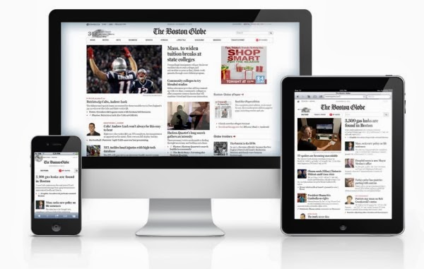
Think of it this way: the same band can play the same songs at a small club one night, and an arena the next – but there are going to be noticeable differences between the two shows, based on how the music (that is, the content) is being delivered. Here are some tips on how to take advantage of those differences and make sure you’re optimized for mobile.
Size Does Matter
The most obvious difference between “mobile” and “normal” is size. No matter how fast, pretty, smart, and slick your phone is, it’s always going to be significantly smaller than your computer screen. (After all, that’s kind of the point.) When you’re designing for mobile, you have to keep that in mind constantly, because your content isn’t going to matter if its users can’t easily read it. Avoid a cluttered screen. Keep it simple, open, and minimal. If you like your aesthetics to be on the busy side, fine – but leave that for the desktop only.
Identify Objectives
A user is on your mobile site for a reason. Maybe they’re trying to stream a movie. Maybe they’re trying to order a pizza. Maybe they just want to look at pictures of cats. Whatever they’re trying to do, push them toward it as rapidly and smoothly as possible. Don’t clutter your mobile design with extraneous features. It may be tempting, but extra information is best left to the non-mobile version.
Maximize Your Compatibility
Sure, many mobile users are playing with their iPhone or Android – but there’s still a pretty sizeable gap between “many” and “all,” and it’s a gap you can’t afford to fall into. Test your mobile design on as many different devices as you possibly can. Not only will this ensure that your content reaches a maximum amount of users, it will also prevent users from associating your brand with irritation and disappointment because your pages fail to work on their devices.
Minimize User Effort
No matter how adept somebody is at texting and tapping away at their miniature mobile keyboards, it’s never going to be as easy as using a full-size keyboard. Furthermore, when you bring a diminutive screen into the equation, tons of text is harder to read. Minimize the amount of work users will have to do. Don’t make them type too much, swipe or tap the screen too many times, or inundate them with requests for frequent logins. The less they have to do themselves, the better. Focus on flow.
SEE ALSO: Five Tips To Make Sure Your Website Doesn’t Suck
Mobile opens up a world of opportunity. Mobile users have the power to access your content underground on the subway, or 30,000 feet in the air. Don’t put any stumbling blocks in their path – choose to go minimal now, and you’ll thank yourself later.
 Shannon
Shannon Carpino is a freelance writer who specializes on topics such as mobile technology, Philadelphia marketing firms, and internet functionality.


